
What I Notice When Translating a Place Into a Brand
How I Read a Place Before I Design for It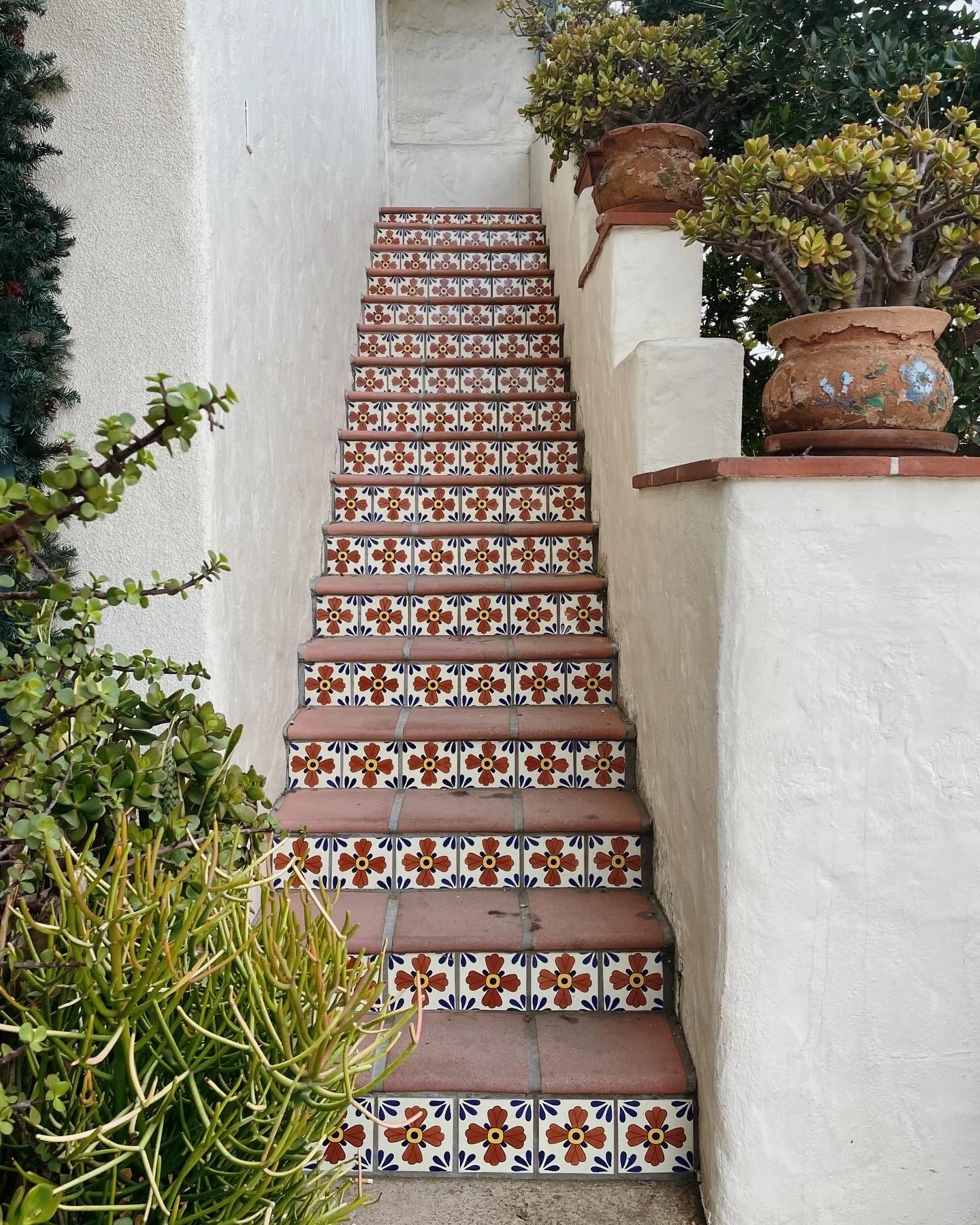
It starts as something you practice deliberately — walking into a space and asking yourself questions, taking notes, searching for things others walk past. Over time, it stops feeling like effort and starts becoming the way you simply move through the world.
When I'm working on a brand that's rooted in a specific place — a café in an iconic neighborhood, a boutique hotel shaped by coastal culture, a retreat immersed within a particular landscape — this kind of attention is how the work begins. Not with a template, but with a series of quiet observations that guide my research before I ever open a design file.
Here are five of them.
Color: The Palette That's Already Evident
What are the colors that keep showing up everywhere?
Not the colors someone mentions because it’s “their favorite”, but the ones that just exist — in the light at a certain time of day, in the plants and the soil, in the construction of the buildings and the way they’re painted. I'm looking for the palette that captures how a place actually feels, not just an assortment of colors that look nice.
Which goes along with the harder question: which of those colors can actually work together and still communicate clearly? Each one must work individually and collectively. A color palette that's true to a place but falls apart in practice doesn't serve anyone. The goal is always a system — something that carries the feeling forward with consistency.
You can see this in the Bebidas brand identity — a color palette pulled directly from bright citrus and salt-washed Key West, not chosen from a Pinterest search.
Letters: The Typography of a Place
What kind of fonts exist in the wild here — on signage, menus, storefronts, landmarks?
Typography in the built environment is rarely accidental. The letterforms on a retro motel sign, the hand-lettered chalkboard at a surf shop, or the chiseled text on a historic building is referencing something, whether it's a historical period, a craft tradition, or a cultural attitude.
When I choose typography for a brand, I'm often tracing that lineage — finding type that references the same origin but reinterpreted into something new. The goal is a typographic voice that feels like it belongs to the place, not borrowed from it.
Texture: What the Materials Are Saying
What patterns repeat? What materials make up the architecture?
Wood, concrete, tile, fabric, plaster — these details do more than decorate. They build context. They tell you whether a place is raw or refined, weathered or new, rooted in craft or elevated through minimalism. Texture is often what gives a brand identity its tactile quality — the reason a logo feels appropriate printed into a piece of kraft paper or debossed on a leather menu cover.
When I pay attention to the materials of a place, I'm looking for the visual language it's already speaking. My job is to translate it, not invent something from scratch.
Nature: The Landscape It Lives In
What geography surrounds this place — ocean, mountains, desert, forest?
What do the plants and flowers look like? What about the seasons? Is this a warm and sun-bleached landscape or something cooler and more dramatic? Nature is one of the most powerful sources of visual identity for place-rooted brands, precisely because it's so unique. A Southern California aesthetic is not the same as an Eastern North Carolina one, even though both involve the ocean. The difference is in the color, the temperature, the cliff-dwelling palm trees versus the dune-swept sea oats (I’m very familiar with both).
I pay close attention to what surrounds a business because those surroundings are often the first thing a guest notices — and the first thing they try to describe when they tell a friend about the experience.
That distinction shaped the Beach Break Surf identity — built specifically around East Coast surf culture.
Culture: What Makes It Feel Local
What stories define this place? What's the lifestyle it attracts and reflects?
This is the question I sit with the longest, because it's the hardest to answer quickly. Culture lives in the things that feel local rather than manufactured — the way people use a space, what they order, how long they stay, what they bring their friends to see. It's also in the things that need to be experienced rather than observed from the outside.
A brand that captures culture accurately doesn't look like it was designed by someone who read a travel blog about it. It looks like it came from someone who spent time there and understood what makes it feel irreplaceable.
The koko·ro project required weeks of research into Japanese and Nordic food culture, language, and design tradition before a single visual was created.
Why These Details Matter for the Brands I Build
There's a version of brand design that prioritizes looking good over meaning something. The result tends to be visuals that are polished on the surface but don't hold up — because they were never really connected to the story behind the business in the first place. I've never found that approach very interesting, and I don't think it serves clients particularly well either.
The brands that feel memorable tend to feel like they were found, not fabricated. They have a visual logic that makes sense the moment you see the space they're representing. The colors seem recognizable. The texture feels right. The fonts look familiar but still catch your attention.
That kind of coherence doesn't happen by accident. It comes from asking the right questions early, staying genuinely curious about the specifics of a place, and resisting the temptation to apply a familiar aesthetic before you've really listened to what's already there.
This is the lens I bring to every project. Not a formula, but a way of noticing — and an honest belief that meaningful brands are built by recognizing the surrounding details that make a place special in the first place.
If that sounds like the kind of process your brand deserves, explore my portfolio to see this approach in action — or get in touch if you're ready to build something that truly reflects your local identity.
— Anna